
Page 56 - FINAT Yearbook 2015
P. 56
JUDGE’S COMMENTS ON THE WINNING ENTRIES
The “Best in Show” and “Printing Processes” Group Awards went to Collotype Labels, Italy for the “Americano Gancia”. Please see the comments in the introduction.
GROUP A MARKETING/END-USE
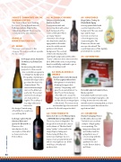
A1: WINES
There were joint winners in this category. The judges could not separate the two entries.
Collotype Labels, Australia for Atlas 2013 Shiraz Clare Valley
An interesting label which purports to show several
star constellations against a soothing blue background. The quality of printing on a textured background is good and the hot foil is
clean and neat. The inverted black triangle mirrors the Atlas logo perfectly. The normal and reversed out type are clean and very legible. The scalloped top edge adds extra
interest to the design. Printed using
offset litho the result is an eye catching label.
Collotype Labels North America Wine and Spirits for Dream No.7 Please see the introduction for the description of this label as it was selected as Best in Show.
A2: ALCOHOLIC DRINKS
Etiketten Carini GmbH, Austria for Devil
A truly memorable and interesting label with a silver devil staring out of the centre of the label! There are many “hidden” elements to the design:
the detail in the skull, the
aging marks in the white
areas, the subtle varnish
patterns in the black
background. The contrast
of the hotfoil skull and the
stark black background and the white “leaves” adds even more interest to this label. Offset litho and screen printing have been skilfully combined to give a really outstanding result.
A3: NON-ALCOHOLIC DRINKS
Skanem Hobro A/S, Denmark for Fun L1ght Jordbaer kiwi A bright and colourful label
showing strong product identity. The printing on PP gives the mounted label a “no label” look. Printed using
offset litho in 8 colours the heavy vanishing makes it look as if the label is an integral part
of the bottle. The reversed out and standard type faces are well
produced. As the title says a fun label.
A4: FOOD PRODUCTS
Cabas S.A. Greece for Minoan Gala – MITERRA Extra Virgin Olive Oil This a very clean looking label. The design shows a ritual dance based on the theme of “Mother Earth” using “earthy” colours with olive shaped figures taking part.
Printed using UV flexo the numerous small type faces in many colours are all printed well and are very legible as are all the small logos. A really well produced job
A6: HOUSEHOLD
Doga Etiket, Turkey for Glade Multi Spray
A nicely printed label with excellent vignettes in the background. The very small type and the type
reversed out of a four
colour image are very
clean and legible. The
flowers are delicate and
are reproduced well. The
overall impression of this digitally printed label is excellent.
A8: AUTOMOTIVE
Holostik India Ltd, India for Hero Motocorp Ltd
A small label with several security features including holographic cold foiling, thermochromics inks and invisible text. It is amazing that 9 colours were used to print this automotive applications label.
A9: COSMETICS
Stratus Packaging, France for Nocibé Lotion 200ml This label is an excellent
example of high quality screen printing. The
images are sharp and well defined and the
sympathetic use of colours along with the
cold foiling adds quality to the end result. Cannot fault it, well done.
56
FINAT YEARBOOK 2015 |
