Page 63 - FINAT Yearbook 2012
P. 63
A10: booklets
Pago International AG., Switzerland for Harmony Fruit & Yoghurt Dessert
A neat label with an unusual shape. This entry comprises three double-sided pages and a tear-off calorie notification. All the small black type on all the pages is sharp and clear. The illustration of the pineapple shows up well against the black background square. The label is easy to access and the perforations and die-cutting very functional. Letterpress has been used to print the label with good clean results.
A11: promotionAl coupons
Pilot Italia SpA., Italy for Print Buyer
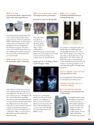
A12: self promotionAl lAbels
This category has two joint winners Germark S.A., Spain for Running Girl
These labels use a
lenticular face-
stock to produce a
3D effect which is
eye-catching. The
image of a girl
running attracts
attention and can be used for many applications. Flexography has been used to produce the basic images. As a promotional tool it fits the bill well.
Purgina spol. S.r.o., Slovakia for The Art of Labels Purgina – Hand
Another eye-catching label which is used for promotional purposes. A combination of flexo, screen and offset litho have been used to produce this almost ethereal image which “comes to life” under UV light. The basic image is printed in CMYK colours.
A13: sets of lAbels
FS-Etiketten GmbH Germany for Perlmutt/Goldrausch
Two dramatic-looking labels with deep black backgrounds and illustrations showing high value items. The “Gold Rush” shower gel gives the feeling of an expensive product inside via precious gold particles. The “Pearl” makes one think of the value of real pearls in the shower! Both labels were produced using letterpress technology and the use of silver inks adds depth to the high-quality argument.
group A AwArd + best in show
Collotype USA for Le Pich
An outstanding label both visually and technically. Deserves the top spot.
printing processes group b cAtegory AwArds
b1: flexogrAphic printing
Skanem Durham, United Kingdom for Comma Prolife
A straightforward looking label with an interesting
production method. Basically flexography is
used to print the main images. The fine tone background has a gentle vignette. The use of the red and blue around the logo and the
A label which looks like a picture frame, interesting! And an interesting, but not new, application. The idea is to cover an area on the front cover of a magazine and then strip off the label to reveal the information underneath. Offset litho has been used for the main illustration which has a fitly modern look. The picture frame has been given substance by using a tactile varnish pattern and a gloss varnish cover to the main illustration. A combination of flexo, screen and offset litho has been used to produce this attractive result.
63
FINAT YEARBOOK 2012 |