Page 64 - FINAT Yearbook 2012
P. 64
FINAT YEARBOOK 2012 |
64
F2 logo adds interest and contrast. But the way that the holographic effect is produced is interesting. A patterned film is brought into contact with a receptive spot lacquer which causes a chemical reaction. The film is removed and the lacquer is now impregnated with a decorative transparent holo- graphic effect. The hologram lifts the label to new heights of decoration.
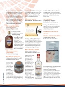
B2: ROTARY LETTERPRESS
Cabas S.A., Greece for Metaxa 7* Flasc 20cl A’side
An attractive metallic- looking label printed using
letterpress printing technology. The deep
blue image contrasts well with the golden background. The medallions and the original 1888 date add authenticity and depth to the label. The label contains several subtle,
almost hidden images.
B3: SCREEN PRINTING (SILK SCREEN)
No winner in this category
B4: REEL-FED OFFSET LITHO
Schäfer-etiketten GmbH & Co. KG., Germany for Bondex Express
A total product
package, a main
label and a
colour guide for
the top of the
receptacle.
Colour rendition
is crucial for the
lid label and for
the colour patch
on the main label. Offset litho has been used for the basic images and flexo for the lacquers and cold foiling. The result
is a well-produced label containing a lot of information regarding the use of the product. The small type is clean and legible. The small illustration of the house is sharp and well defined.
B5: DIGITAL PRINTING
August Faller KG., Germany for binop
A neat eye-catching label in only two colours! Black and white printed on a metallised substrate. The very small type is very legible and the use of a hybrid screen softens the vignettes to some degree. A simple yet effective result using digital printing technology.
B6: COMBINATION PRINTING
Skanem Poznan, Poland for Soplica Szlachetna Wódka 500ml
A traditional-looking label with a very distinctive shape. The combination of flexography, screen printing and cold foil has produced a nice looking label. The central drawing of a mansion house and the certificate across the bottom of the label feature very fine lines which reproduce extremely well. The gold surround on the main part of the label and
the foil medallions add an air of luxury and high quality. All the small italic type is very legible and the brand name in red gives a nice contrast to the fine grey background.
GROUP B AWARD
Skanem Poznan, Poland for Soplica Szlachetna Wódka 500ml
A well-produced label offering the expectation of a product of quality and sophistication in the bottle. A well deserved Group winner.
NON-ADHESIVE APPLICATIONS GROUP C
C1: NON-ADHESIVE LABELS/TAGS
Skanem Poznan Poland for Eveline Cosmetics – Anti-Stress
Flexography seems to be dominating the awards this year. This label is no exception. The skin tones are exceptional with nice smooth vignettes. The grey background provides a nice contrast to the face. The small black and coloured type is very sharp and very legible. The touch of silver in the brand name adds just the right amount of flair to the end result.