Page 71 - FINAT Yearbook 2014
P. 71
CLASS 2 FLEXO LINE/SCREEN
Eyüp Sabri Tuncer Dogal Zeytinyagli El Ve Vücut 250 m
Bahar Etiket, Turkey
This label for natural Olive Oil is printed in 6 colours using UV flexography. The line illustration and the small black type are sharp and well defined. The use of the half green background and the “floating” circular images adds interest to a well produced label. Being printed on opaque polypropylene gives the design a boost.
CLASS 10 OFFSET LINE/SCREEN
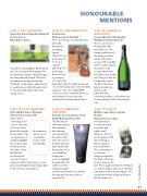
5lt Coral Black Velvet - Denmark Skanem Ltd. Liverpool, UK
A label full of
contrasting, bold
CLASS 12 OFFSET WINES/SPIRITS
Carnival Love
Collotype Labels, Australia
This is a very busy, colourful label wine label with
illustrations
portraying
typical
characters one
would expect
to see at a
carnival
gathering. The
under lying
theme of love
is portrayed
not only by the
main title but by the subtle hearts and roses in the main picture. UV offset litho using a 200 line screen and CMYK colours is used to obtain the fine lines and subdued colours required to produce this understated wine label.
CLASS 14 COMBINATION
LINE /SCREEN
Victoria’s Secret Luminous Touch Smyth/Dow Industries, USA
This label has an
immediate impact
with radiating
lines drawing
ones attention to
the centre of the
label. The use of a
metallic substrate
adds depth to the
finely printed four
colour halftone
background
serves to highlight
the main title. The
subtle use of hot
foiling along with
a tactile varnish and screen printed lettering gives the whole label a luxurious feel.
CLASS 16 COMBINATION WINES/SPIRITS
Pure and Careful craftsmanship IPE Spain for Planas Albareda There is a lot more to
this label than first
meets the eye. The
background shows off
the subtle use of the
initials of the main
product “PA” and “DA”
in three shades of grey.
Then there is the
screen printed main
title with a clean tactile
feel. The gold, italic hot
foiling addes class to
the label. The whole
label is printed on a
luxurious silk
patterned silver
substrate using flexo, offset litho and screen printing. A label of undoubted class.
CLASS 21 BOOKLETS
Oriflame 19640 Anti-perspirant Booklet
Skanem Poznan, Poland
A well produced
booklet label with
very sharp and
legible small
typefaces. This is a
good example of UV
flexo printing on
filmic and paper
based substrates.
The contrasting use
of a neutral
background against
the black of the main
product name works
well. This is augmented by the intelligent use of hot foiling to add class to the label. Lamination enables the front page to be separated from the background part of the label with ease.
colours. The main
colour is a dense
black reflecting the
product name. The
use of yellow, red
and blue highlight
the product name
and the pack size.
The shape of the
label fits the
product bottle
contours. Printed
using offset litho and a 175 line screen gives smooth vignettes and sharp edges to the reversed out typefaces.
HONOURABLE MENTIONS
No permission was received to publish a picture of the winning label
71
FINAT YEARBOOK 2014 |