Page 44 - FINAT Yearbook 2011
P. 44
printing processes group b category awards
b1: flexographic printing
Wintek Flexo Prints, India for Himalaya Revitalising Night Cream
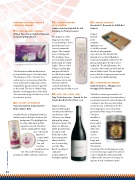
The illustration within an illustration persuaded the jury to select this entry. The sharpness of the “internal” box enabled us to read every word and the deep, rich purple background contras- ting with the pale green herbs gave life to the result. The use of a little foiling lifts the overall appearance of the label. The reversed out type for the four colour tone areas is spot on.
b2: rotary letterpress
Pago International, Switzerland for Malve-Mauve Bath
A really delicate looking label with nice halftones and soft flower shades in the background. The highlight dots
are especially sharp and the vignettes smooth. This label
exudes quality and the sharp- ness of the small
type faces coupled with
foiling gives
the end result an
overall luxurious feel. This is UV letterpress
printing on a filmic substrate at its best.
b3: screen printing
(silk screen)
schäfer-etiketten GmbH & Co. KG, Germany for Trinity Créasoin
The sharpness of the images produced by screen printing over the past few years never ceases to amaze the judges. This example does not disappoint. The small type faces are very sharp and well defined and are totally legible. The use of hot foiling is exactly right and gives the label a nice lift from an added quality point of view. The mauve circles and the Swiss emblem contrast well with the grey lettering. A really
b4: reel fed offset litho
Tapp Technologies Inc., Canada for Sea Smoke One Barrel Pinot Noir 2008
Tapp has always impressed the judges over the years with their excellent use of the offset process. Always high quality, always delicate in design. This label is no different. Subtle grey lettering moving to solid
black, impeccable debossing and the almost invisible
use of clear foiling
over the “One
Barrel” wording. A really well
produced label of
the highest quality.
b5: digital printing
Flexiket A/S , Denmark for ASDA Bed Cabinet
A larger
than life
print
using the
digital process
to its full potential.
An almost photographic
reproduction. The detail in this
large label is excellent. Quality is required and quality is delivered. The glossy varnish gives the label a nice quality lift. The label illustrates the contents of the card board box with an almost lifelike result. The run length proves that the longer press runs can be economical for digital printing.
b6: combination printing
Kimbells Pack Inc., Philippines for Arengga Coffee Alamid
This label is a true representation of combination printing. Several machines, several passes and several techniques all combine to give this very interesting result. The use of letterpress for the basic image gives a nice deep back- ground and a fine range of dot values. The silver
metallised
substrate
gives added
quality. The
white text
using the
screen
process is
sharp and
well defined.
The delicate
rendering of the tactile pigment using screen technology requires the utmost control. Finally the embossing of the outline of the civet cat is in very good register. A real combination print.
nice job.
44
FINAT YeArbook 2011 |


