Page 43 - FINAT Yearbook 2011
P. 43
a10: promotional coupons
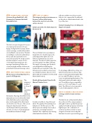
Schreiner Group GmbH & Co. KG., Germany for Consumer label with Detachable Parts.
a12: sets of labels
This category has three joint winners as the jury could not differentiate between the merits of each of the entries selected.
Kolibri Labels B.V., The Netherlands for Brouwerij ‘t IJ
This set of labels looks very simple in design but a lot of work has gone into achieving just the right look of old- fashioned authenticity on modern materials. The labels look like paper but are in fact printed on a filmic substrate. The simple colour ways give the whole set a delightful feel reflecting the traditional beers inside the bottles. The letterpress process has been used very successfully to produce this set of beer labels without losing the feel of this small Amsterdam brewery.
CheMes M Szperlinski, Poland for Dr. Marcus Titanium Series
A really colourful set of peel & reseal labels. The quality of the printing does full justice to the flexo process. The labels represent a family of associated products to a very high technical standard. The complexity of producing a label with de-activation of the
adhesive and then to achieve reseala- bilty is to be commended. A really well produced set of labels takes them to the top of the class.
Stratus Packaging, France for Delpeyrat Magret de Canard
This label concept is designed for use as a decorative/promotional tool for pac- kaging. Peeling back the top layer, which carries a message, reveals stickers which can be affixed to various items. The label is a multilayer construction which allows the top and subsequent labels to be removed separately. The design used for this demonstration consists of bold colours which draw attention to the message. Printed using UV flexo the colours are bright and the solid areas are printed well. A universal message carrier.
a11: self-promotional labels
IPE Innovaciones Para Etiquetajes S.L., Spain for IPE Pigments
This category is designed to show off the capabilities of the individual
label printer. By using offset litho for the main print process to achieve the detail in the illustration and screen printing plus a tactile pigment the label stands out from the rest. The use of the screen image also imparts a fade effect to
the illustration which is particularly effective. Good use of optical pigment- ation with two attractive designs.
Food is always difficult to portray on a label. However, this set achieves that purpose extremely well using the flexo process and CTP plates to produce some mouth watering illustrations. The duck meat looks tender and ready to eat. The addition of green vegetables gives a sort of colour balance to each label. The different colour ways add a touch of individualism to the set.
group a award + best in show
Collotype USA for Kenwood Artist Series.
This label stood out head and shoulders above the rest of the category winners although it is fair to say that the general quality level in this group was extremely high this year. The combination of technical excellence and an evocative design are the main reasons why this label was chosen to represent this group.
43
FINAT YeArbook 2011 |


