Page 67 - FINAT Yearbook 2014
P. 67
A12: BOOKLETS
Arca Etichette, Italy for Pivetti Impasta & Vinci 2013
has been used to print 9 colours plus 2 hot foilings and embossing in a single pass. The various levels of embossing coupled with the raised varnish on some of the black type adds considerable depth to the end result. The unusual die cutting pattern gives the appearance of a vintage bus ticket. Technically demanding and visually challenging this is a really good example of how to market the company’s ability to print labels.
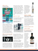
A15: SETS OF LABELS
There were Joint winners in this category as it was difficult for the judges to choose between the two winners.
Permapack AG, Switzerland for I Am Deo Roll-on 50ml
A neat set of labels printed by flexography and screen techniques with hot foiling and a protective varnish. Six colours were used to produce a variety of colours on each individual label. The slightly tapered shape is designed to fit on a small roll-on container.
Marzek Etiketten + Packaging, Austria for Cserszegi Pálinka
A visually stunning set of 8 labels with an unusual arrow/bookmark shape. Printed in 5 colours using offset litho the quality of the printing is very good. The hot foiling overall is well produced and sharp especially in the coat of arms. The
diamond pattern of lines in the background of all the labels adds interest to the result along with the very prominent Fleur de Lys in the background and in the diamond logo in the lower half of the label. A very nice result.
GROUP A AWARD
Collotype Labels – Griffith, Australia for De Bortoli Wines – La Bohème
This is a very attractive label with an opera theme. The complexity of the flowers surrounding the central figure adds an extra depth to the finished result. The use of a subtle buff colour surround encapsulates the main figure very well. The six colours were printed using offset lithography and finished off with a satin varnish.
PRINTING PROCESSES GROUP B CATEGORY AWARDS
B1: FLEXOGRAPHIC PRINTING:
St. Luc Labels & Packaging, Belgium for The King’s Ginger
A very neat and
royal looking label.
Printed using
flexography in 6
colours plus two
varnishes and gold
cold foiling this
label presents a
clean and
attractive
appearance. The
italic black type is
extremely well
printed and the
use of gold foil infill
in the lettering adds class as does the excellent foiling around the portrait of King Edward 7th.
A dynamic looking label which draws attention to the illustration of the ship in the centre circle. The green and yellow stripes contrast well with the blue of the seascape. The front label opens easily and the wording and scratch off panel is easily accessible. This label works well as a marketing vehicle and a prize promotional job. Printed in four colour process colours using flexography for the total label including the inside pages.
A14: SELF-PROMOTIONAL LABELS
Multi Labels Ltd, United Kingdom for Printers Proof Gin
The actual label is part of an impressive promotional package for Multi Labels which includes the outer packaging for the bottle. The label demonstrates the many processes that the company can offer. Flexography and screen printing
67
FINAT YEARBOOK 2014 |